Once a set of raw scores has been organized into a tabular distribution, we can consider the shape of the distribution. The most common way to accomplish this visually is to graph it with the scores along the horizontal axis and the frequencies (f) along the vertical axis. The result is formally known as a frequency polygon, and more commonly as a line graph. When the number of cases is very large, the polygon will tend to take on a smooth shape that is often referred to as a curve.
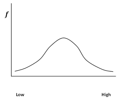
The most important shape of any distribution in statistics is the normal curve. This curve, illustrated below, is also called the bell curve because of its resemblance to a bell. This curve is often found in nature. That is, the majority of cases tend to cluster around the mean, and become increasingly rare the farther you get from the mean. It is easy to find a man who wears a size 10 shoe because that is about average. You will have a much more difficult time finding a man who wears a size six shoe, as you will with a man that wears a size sixteen shoe. The normal curve is also very important because its properties allow us to do inferential statistics, a topic that we will cover in later sections.
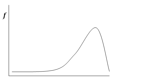
Some distributions are not normal. That is, they do not have the characteristic bell shape. It is possible for scores to cluster at one extreme (high or low) rather than in the middle. Such distributions are said to be skewed.
A distribution is said to be skewed when scores cluster to the left or right rather than the center.
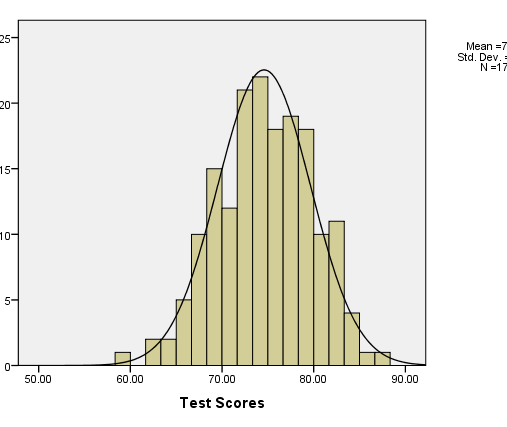
When scores cluster on the low end and the tail is longer to the right, the curve is said to be positively skewed. When scores cluster on the high end and the tail is longer to the left, the curve is said to be negatively skewed. Positive and negative refer to which end of the number line the long tail points. The Histogram in the figure below shows a frequency distribution of a set of test scores. The curve overlaid on the histogram is a normal one. We can tell by how well that the histogram matches the normal curve that our test scores are normally distributed.
A more precise way to determine the skewness of a set of scores is to examine a skewness statistic. The skewness statistic takes on both positive and negative values. If the skewness is positive, then the data are positively skewed. If the skewness statistic is negative, the data are negatively skewed. If the skewness statistic is equal to zero, then the curve is perfectly symmetrical. Note that a perfectly symmetrical curve almost never happens with real data. There will be some slight deviation from symmetry. In interpreting the skewness statistic, many researchers consider any value over 1 to be extremely skewed, any value between 0.5 and 1 to be moderately skewed, and any value below 0.5 to be approximately symmetrical.
Another potential problem has to do with the distribution’s central peak. A normal curve is expected to have the “bell” shape. Some distributions will be tall and pointed, and some will be flat and broad. When the central peak of the distribution is not as expected, it is referred to as kurtosis. If the distribution is tall and peaked, it is known as mesokurtic. If it is short and broad, it is known as platykurtic.
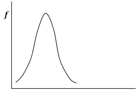
Like the skewness statistic, a normal distribution has a kurtosis statistic of zero. Positive kurtosis values indicate that the observations cluster more, making the distribution peaked (mesokurtic). Negative kurtosis values indicate that the observations cluster less and have shorter tails (platykurtic).
Distributions that have two peaks are known as bimodal distributions. Note that this does not mean that the data have two values that tied exactly for the mode (the most frequently occurring value). The points do not have to be exactly equal in height. The term bimodal is used less precisely to describe a distribution that has two obvious high points.
Computing Descriptive Statistics in Excel
For many descriptive statistics, Excel provides individual functions to calculate them. If you want to produce several descriptive statistics at the same time, it is easier to use the Descriptive Statistics Tool in the Analysis ToolPak. The ToolPak is a set of automated tools that allow you to conduct statistical analyses that would otherwise be tedious or not available with regular Excel functions. It is an add-in, so you need to load the ToolPak the first time you use it.
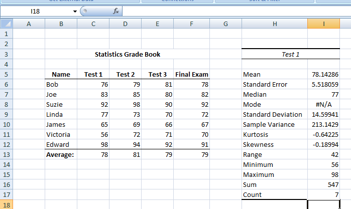
Figure 7 above shows the results of running the Descriptive Statistics Tool on Test 1 of the hypothetical statistics grade book data. So far, most of these statistics will be unknown to you. You should, however, notice that the “mean” reported in the Test 1 table is the same as the “average” reported at the bottom of the Test 1 column of the grade book. The “sum” in the Test 1 table is ΣX, which means all the scores (for Test 1) added up. The “count” is the number of cases (subjects) which we will symbolize as n.
Loading the Analysis ToolPak in Excel

1.  Click on the Microsoft Office Button, then select Excel Options.

2.  Click Add-ins, and then the Manage Box, then select Excel Add-ins.

3.  Click on Go.

4.  Find the Add-ins Available Box, then select the Analysis ToolPak and then click OK.

 Note: After you load the Analysis ToolPak, the Data analysis command is available in the Analysis group under the Data Tab.
Key Terms
Distribution, Normal Curve, Symmetrical, Skewness, Positive Skew, Negative Skew, Kurtosis, Platykurtic, Mesokurtic, Bimodal Distribution, Matrix, Spreadsheet, Cell, Data/Datum, Measures of Central Tendency, Mean, Median, Mode, Measures of Variability, Range, Interquartile Range, Variance, Standard Deviation, Skewness Statistic
Last Modified: 02/03/2021
