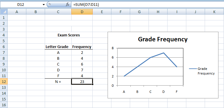
To generate a line graph of frequencies in Excel, you will need a frequency distribution table with the column headings in one column and the frequency counts in the other. To generate the graph, simply highlight both columns. Then, under the Insert tab, find Charts then choose Line. For the most traditional-looking line graph, choose the first two-dimensional style under the available options.

Common Myths about Line Graphs
So, you know when you hear something many times, and you start to believe it? Well, a lot of folks think line graphs are just about counting stuff. In subjects like psychology or sociology, this might often be true. They use line graphs to show how often something happens.
Line Graphs in the World of Business
Now, if you peek into the business world, especially places where people deal with money and stocks, line graphs have a whole different role. Think about a stock market graph you might’ve seen in movies or on TV. These graphs are all about showing the rise and fall of prices. On such a graph, the higher the line, the higher the price. And where the line is, left to right, tells you when that price was happening. It’s a bit like watching the heartbeat of money!
For people buying and selling stocks (they call them ‘traders’), understanding these graphs is super important. They can choose to look at prices change by the minute, hour, day, week, or even months. Making the wrong call because of misreading a graph can cost a lot of money!
Why Do Traders Love Line Graphs So Much?
Imagine being able to look at a picture and predict the future, at least a little bit! That’s why people in finance love line graphs. These graphs can show patterns. For instance, if someone looks at a graph for a company, say Microsoft, they might notice its stock price went up in April but dipped a bit in May. Seeing this, they might make guesses about what the stock might do in June. It’s like trying to spot patterns and trends to guess what comes next. Not always perfect, but it gives them a clue!
Frequency Polygons vs. Line Graphs
A frequency polygon and a line graph are both effective tools for displaying data. While they might seem similar, they serve different purposes and have distinct characteristics.
Frequency Polygon
- Definition: A frequency polygon is a graphical representation of a distribution. It connects midpoints of the tops of bars in a histogram, showing the frequencies of various classes.
- Purpose: Its main use is to give a visual depiction of the distribution of continuous or discrete numerical data.
- Appearance: Starts and ends on the horizontal axis, typically at a value of zero for the frequencies. The points representing the midpoints of each interval are connected with straight lines.
- Usage Scenarios: Commonly used in statistics to show the shape of data distributions and identify trends, particularly in grouped data.
Line Graph
- Definition: A line graph displays data points connected by straight lines. It primarily visualizes values in a sequence, often over time or other continuous scales.
- Purpose: It is used to track changes over periods and to make predictions about future values.
- Appearance: Consists of an x-axis and a y-axis, with data points plotted at regular intervals. These points are connected by lines to indicate a trend or progression.
- Usage Scenarios: Common in various fields such as business, economics, and sciences to visualize trends or compare changes over the same period for multiple groups.
Contrasting the Two
- Data Type: While frequency polygons represent frequencies of data classes, line graphs depict a series of data points in a sequence.
- Origins: Frequency polygons start and finish on the horizontal axis, whereas line graphs do not necessarily need to.
- Application: Frequency polygons are more tailored to statistics and the representation of data distributions, while line graphs have broader applications across fields and contexts.
In summary, while both frequency polygons and line graphs provide visual insight into data, they focus on different aspects and are tailored to distinct types of data analysis.
Summary
Here’s a clear, step-by-step guide to create a line graph of frequencies in Excel:
Prepare Your Data:
Ensure you have a frequency distribution table in Excel.
The table should have two columns: one for the column headings (or data categories) and another for the frequency counts.
Select Your Data:
Click on the first cell in your column heading, then drag your cursor to the last cell in the frequency count column, ensuring all relevant data is highlighted.
Access Chart Options:
Navigate to the top menu and click on the “Insert” tab.
Find Line Chart Option:
Within the “Insert” tab, look for a section labeled “Charts”.
Under “Charts”, you’ll find a chart type labeled “Line”. Click on it.
Choose Your Style:
A dropdown menu will appear with various line graph styles.
For a traditional line graph look, select the first option in the “2-D Line” section.
Finalize and Review:
Excel will generate the line graph based on your selected data.
Position or resize the graph as needed. Double-check to ensure your graph accurately represents your data.
Remember, you can always customize the graph’s appearance further by right-clicking on various parts of the graph and selecting the available formatting options.
Key Terms
Frequency, f, n, Outlier, Skewness, Line Graph
Last Modified: 09/27/2023
