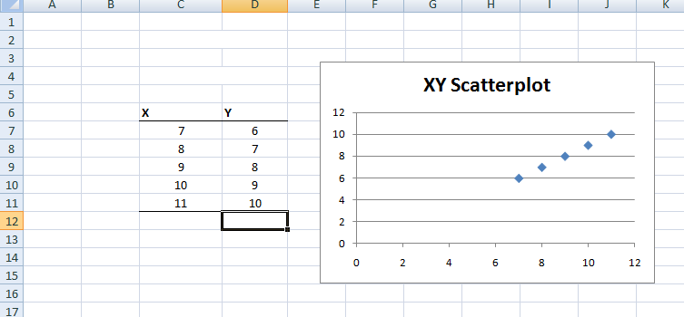
To generate a scatterplot in Excel, first, you need to construct a data table that contains scores for your X variable and your Y variable. Once you have the scores entered, highlight both columns of scores. Under the Insert tab, find Charts and select Scatter. In the example below, the first option without any kind of lines was selected. The legend is set up for categorical data, so it was deleted.

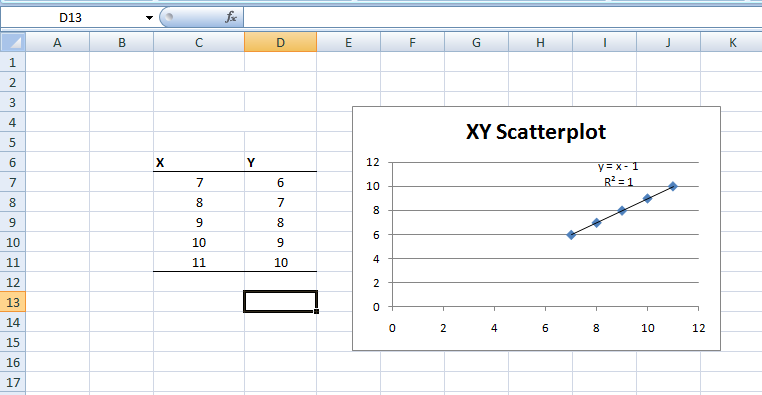
Excel will also fit a regression line to your data points on the chart. To accomplish this, right-click over the data points in the chart and select Add Trendline. In the dialog box that opens, you can select several line options. At this point, you will want to leave this on the default setting of linear. There are also check boxes at the bottom that allow you to elect to have the equation for the regression line and the quantity R-square printed above the regression line on your chart.

Last Modified: 06/03/2021
